Reimagining the Product Experience
Most ecommerce redesigns start with 'what does the page look like? The better question iS - WHat is stopping this person from trusting us enough to buy?
A full redesign of Myer's Product Detail Pages across desktop and mobile — covering imagery, pricing, size & fit, stock visibility, the mini bag, and category-specific experiences for apparel, fragrance, skincare, and more.
The scale of what was broken:
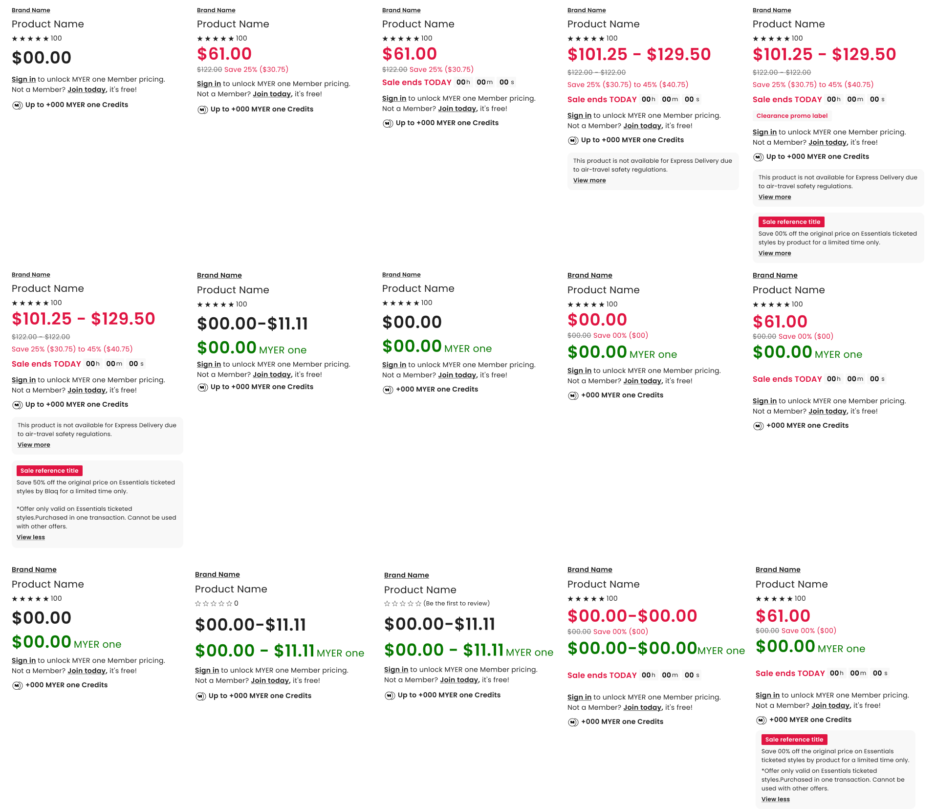
Product images were auto-cropped incorrectly, producing false whitespace and inconsistently sized thumbnails across 1–8 images per productThe pricing and promotions system had grown to over 40 unique combinations — individual, ranged, discounted, members-only, sale — with no consistent visual hierarchy
A/B tests powered by Dynamic Yield (Mastercard) were implemented as patch jobs rather than hardcoded, causing buttons and CTAs to anchor to images instead of the page layout
The mini bag only showed individual items, with no compound savings display, no loyalty acquisition, and no wishlist-like editing behaviour
Size guides were static five-column tables with no dynamic scrolling, no real customer fit data, and no responsive behaviour
Stock availability was partially built — but not surfaced early enough in the funnel to prevent customer disappointment
Category pages for fragrance, skincare, and homewares had no product-specific design logic whatsoever
Creating price harmony by considering each and every price and promotion combination and ensuring they looked good and accurately represented an offering, ensured that edge cases which were conflicting and jarring were no longer resulting in significant overall changes.
My role
Lead UX Designer — end-to-end ownership across research, strategy, design, and validation for the full PDP redesign.
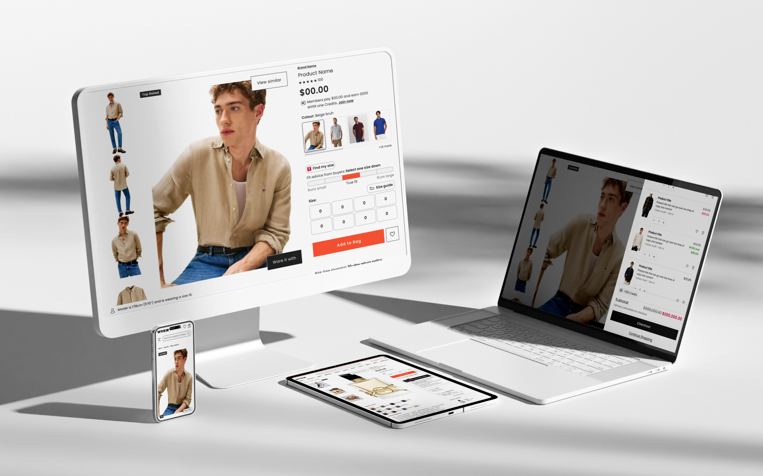
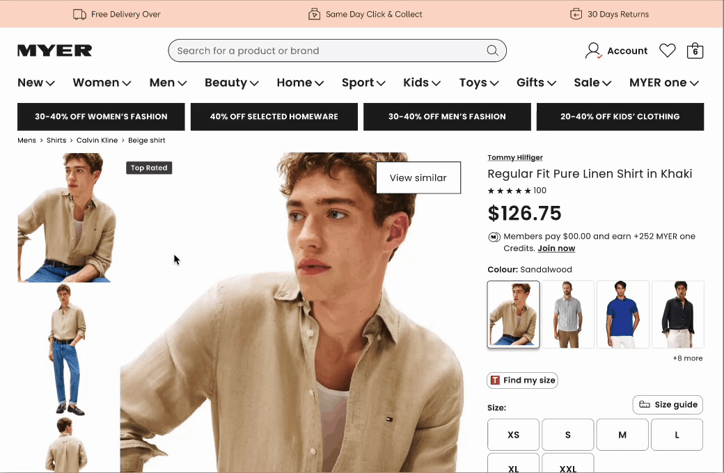
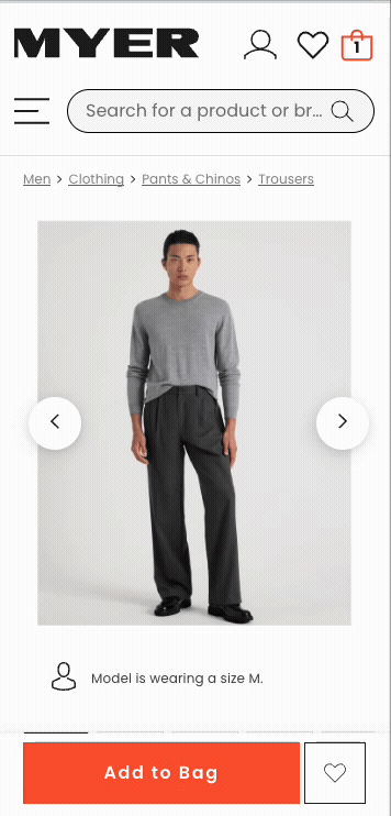
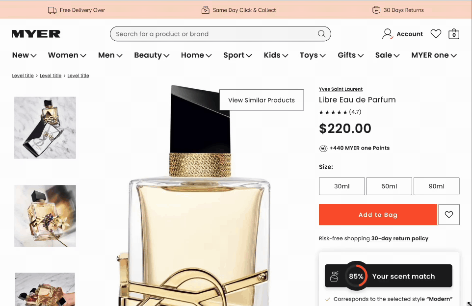
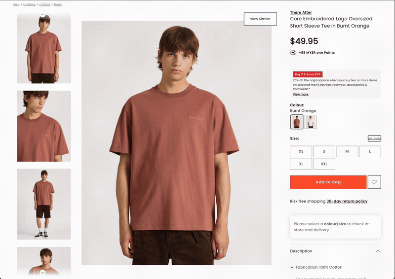
01 — Product Imagery
The Problem?
Myer's Product Enrichment Platform (PEP) only accepted 3:4 aspect ratio images. Suppliers delivered either 3:4 or 1:1.
The result was automated cropping that introduced false whitespace and incorrectly sized imagery — and products could have anywhere between one and eight images, making it impossible to design a consistent page layout.
No zoom functionality existed, meaning customers who wanted to inspect detail had to resort to their browser's built-in zoom — a behaviour our research captured on camera six or more times per test session
The Solution. Desktop
I redesigned the image layout so that the primary image size increased by 35%, while all additional images were aligned vertically on the left-hand side within the same viewport. This created a streamlined PDP that looked intentional and balanced whether a product had one image or eight — no empty space, no awkward gaps.
I also designed an enhanced zoom interaction: users could isolate any individual product image and explore it in genuine detail — not the blurry browser zoom they were resorting to, but a deliberate, high-resolution inspection experience.
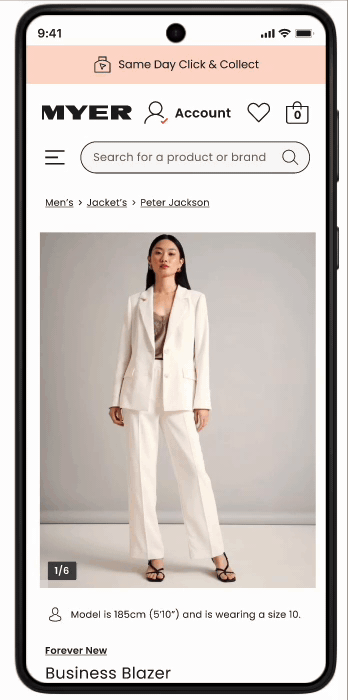
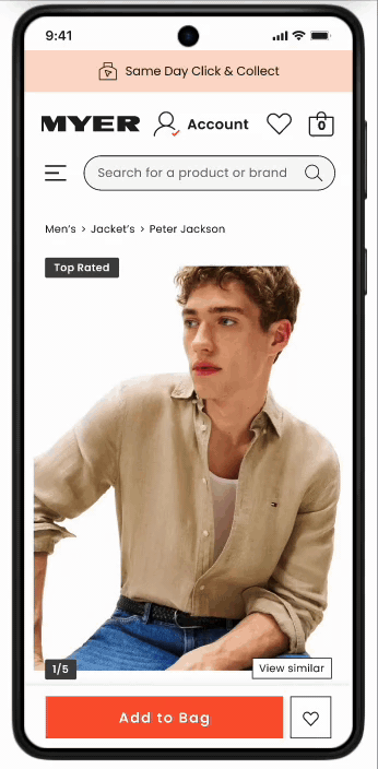
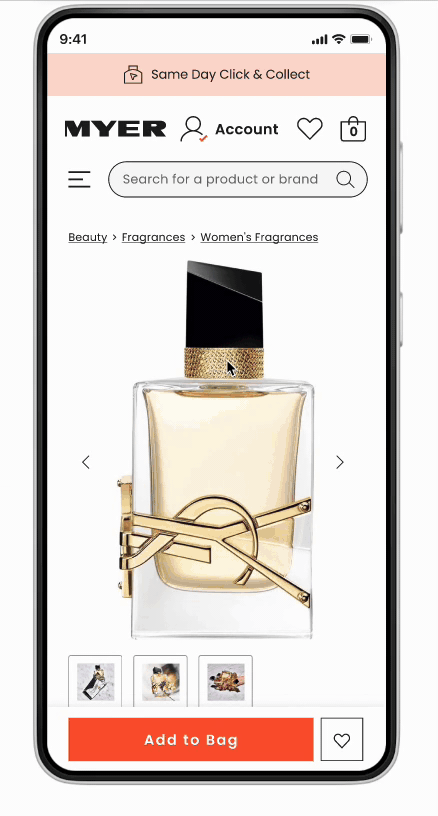
The Solution. MOBILE
Mobile required a completely different philosophy. I made images full-bleed — edge to edge, no padding — removed thumbnails entirely, and deliberately sized the image so it was slightly cropped at the bottom of the screen. This wasn't an oversight. It was a cue. A partially hidden image tells the user there is more to see. It invites the scroll. It is the digital equivalent of a shop window that doesn't show you everything.
This approach also transformed colour selection. Rather than abstract colour swatches — which research confirmed 'don't truly represent the colour or pattern of a product' — I surfaced large product images of each colour variant. Our user testing scored this 6.8/7 for colour discovery ease, with participants explicitly stating it helped them match products to their wardrobe and skin tone.
rESULTS
One finding worth calling out: 20–30% of users initially missed additional colour options when we defaulted to showing only four. This validated a key behavioural insight — when colour variety is a product's selling point, hiding most of those options behind a 'show more' interaction is friction, not simplicity. The progressive disclosure pattern was revised accordingly.
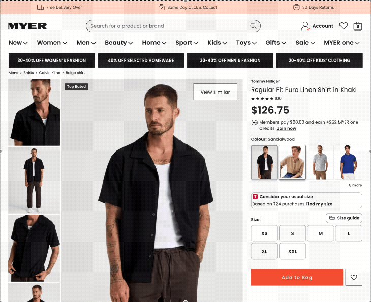
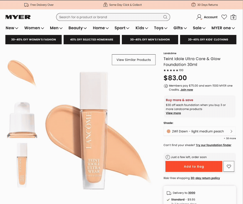
01 — Pricing and promotions
The Problem?
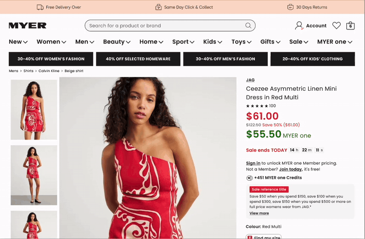
Myer's pricing architecture had grown organically into something that would give any designer a quiet crisis. Individual prices, ranged prices, discounted prices, members-only prices, sale periods, buy-now-pay-later overlays — in total, up to 40 unique combinations of pricing and promotion states, all of which could appear simultaneously, all of which needed to look intentional and clear.
The challenge wasn't designing for one price type. Anyone can do that. The challenge was ensuring that any arbitrary combination of those 40 states remained readable, correctly weighted, and conversion-positive at any given moment — on a 375px mobile screen.
The Solution
I built a pricing hierarchy system that communicated not just the current price, but the full value story: the original price, the discount percentage, and the dollar amount saved. Research confirmed what behavioural economics has known for decades — people respond to loss framing. Showing '$47 saved' alongside a sale price converts meaningfully better than a price change alone.
BNPL (Buy Now, Pay Later) placement was another lever. User research showed customers wanted to see Afterpay prominently on the PDP — near the add-to-bag button — because it influenced their willingness to spend more per session. 'If I can see I can spread the cost, I'll add more' was a near-universal sentiment.
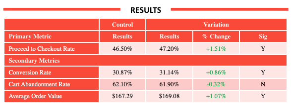
RESULTS
03 — cta’s, upsells & promos
The problem
Myer ran regular A/B tests powered by Dynamic Yield by Mastercard. The problem was implementation: tests were patched onto the page rather than hardcoded, meaning buttons and interactive triggers anchored themselves to images rather than to page layout.
On mobile, this created a collision between CTA buttons, pagination indicators, and FOMO labels — the temporary overlays that flag low stock or limited-time offers and that, when they work properly, are genuine conversion drivers.
The solution desktop
For desktop, I designed properly hardcoded button layouts that existed independently of image containers — straightforward, but requiring careful collaboration with the development team to undo the existing patch architecture.
The solution mobile
For mobile, the challenge was spatial. I mapped out all the elements that could appear simultaneously on the image area — pagination dots, FOMO labels, add-to-bag CTA, and Dynamic Yield upsell triggers — and designed a z-index and placement system that ensured nothing collided, nothing was obscured, and the FOMO label (which research confirmed increased conversion when visible) remained prominent without covering navigation.
RESULTS
my team
Embedded within Myer's digital product team, collaborating with development, the Dynamic Yield A/B testing team, analytics, NPS stakeholders, and the TrueFit API team.
STRATEGY
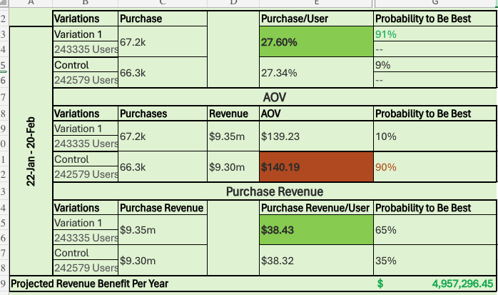
I mapped the full purchase journey to identify where trust was breaking down — imagery that couldn't be inspected, pricing too complex to parse, size guides nobody used, stock disappointment arriving too late. Each feature was prioritised against NPS impact, ATB rate data, and revenue potential, including a $13M AUD projected uplift for stock visibility alone.
04 — mini bag
The solution
I rebuilt the mini bag from scratch. The redesign introduced full item editing — add, remove, and change quantities without leaving the bag. When multiple items were present, the bag calculated and displayed compound savings, showing users the total value of their discounts across their entire selection. This wasn't a small thing: seeing '$83 saved across your bag' is a fundamentally different emotional experience to seeing individual prices.
I also introduced a loyalty acquisition point for non-members. Rather than waiting until checkout to mention MYER one, we showed users how many points they would earn on their current bag total. This reframed the loyalty programme from a checkout afterthought into a pre-purchase incentive.
Critically, this moved a significant volume of decision-making out of the checkout flow — which was already heavily loaded with delivery type selection, click and collect, payment method, and address entry. Culling the bag in the mini bag meant arriving at checkout more intentionally.
The results
The problem
The existing mini bag did one thing: it showed you what you'd just added. That's not a shopping tool. That's a receipt.
User research revealed something more interesting: customers were using the bag as a consideration space — a place to hold products while they kept browsing, editing, and comparing. They'd add six things, come back later, and make final decisions. Some were waiting for payday. Some were waiting for a sale. The bag was functioning as a wishlist, but designed as a notification.
COMPETATIVE BENCHMARKING
Getting stakeholder support to drive this an initiative to work on was difficult and initially deprioritised over and over again as the proposed value was lesser than other projects in which i could spend my time on. in order to validate that a mini bag would drive conversion and at to bag numbers i ran an unmoderated user test with best in class retail brands who were utilising a mini bag. This low cost/low touch approach allowed me to test similar functionality and messaging I intended on integrating into my designs.
I benchmarked two competitor implementations — I benchmarked two competitor implementations — 'House' and 'Percival' (Temple & Webster) — using unmoderated usability testing with SEQ scoring on the item-addition task'House' and 'Percival' (Temple & Webster) — using unmoderated usability testing with SEQ scoring on the item-addition task.
House was preferred for its transparent shipping communication and compound savings display. Percival was praised for distraction-free navigation. Both informed the Myer mini bag design — I took the savings visibility from House and the minimal navigation approach from Percival.
The projected based on the test being ran was substancial
05 — Size & Fit
The problem
Returns are expensive. For an apparel retailer the scale of Myer, a percentage point reduction in return rate translates to material revenue. The root cause of most size-related returns is not that customers are careless — it is that static size guides are genuinely useless. A table telling you that 'M = 38–40 chest' is information, but it is not confidence.
The existing size guide was a static five-column table with no responsive behaviour, no scroll, no dynamic engagement, and no integration with real customer experience data. On mobile, it was essentially unreadable.
The RESULTS
The SOLUTION
I redesigned the size guide into a dynamic, scrollable table built from JSON data, with sticky headers ensuring key information remained visible as users explored detailed sizing specifications. The table moved from a fixed five-column limit to infinite columns — meaning complex products with extended size ranges were no longer truncated.
I integrated TrueFit — an existing API that aggregates real customer purchase data to generate fit recommendations. Rather than just displaying a table, the PDP now showed customers what real buyers of their body type reported: 'Size down,' 'True to size,' or 'Size up,' drawn from hundreds or thousands of actual purchases. Research confirmed customers trusted peer data over brand-provided sizing guides.
I also added a measurement toggle allowing users to switch between metric and imperial, and began scoping illustrated how-to-measure guides with body diagrams. The taxonomy for the illustrated guides proved too complex for the development team's timeline, but the framework was documented for a future sprint.
07 - cATEGORY SPECIFIC PAGES
Department stores sell everything. That is their strength and their design problem. A page designed for a t-shirt is not a page designed for a Chanel perfume or a KitchenAid stand mixer. I designed distinct content architectures for the categories where the standard PDP template was genuinely failing customers.
The 'scent wall' problem is well-known in fragrance retail: how do you sell smell online? The answer, it turns out, is education and inference. I redesigned the fragrance PDP to break products down into top, heart, and base notes — presented as interactive, expandable tabs rather than a block of text — so customers could understand the composition of a fragrance and form an informed expectation before purchasing.
The redesign also leveraged AI inference to surface ingredient information in a digestible, interactive format. Where products had celebrity or lifestyle associations, multimedia content was elevated to lead the experience — because product perception is a major conversion lever for fragrance. Seeing the right person in the right visual context does the work that smell cannot.
Fragrance — Solving the Scent Wall
I adopted and completed a partially built stock availability tool, then pushed its introduction further up the funnel. Rather than waiting for customers to reach a PDP to discover their preferred store had no stock, the tool now surfaced on the homepage and Product Listing Pages (PLPs). Users could define their location once, and have that context carry through their entire browse session.
The business case was clear: estimated annual revenue benefit of +$13 million, driven by improved add-to-bag rates, expanded product range visibility online, and reduced customer disappointment at point of decision.
VALIDATION
Nothing shipped without being tested. Usability scores hit 6.81/7 for image gallery and 6.8/7 for colour discovery on the SEQ scale. Post-launch tracking covered AOV, CVR, ATB rate, and return rate. Design decisions that tested poorly — including a progressive disclosure pattern that hid colour options from 20–30% of users — were revised before launch, not defended.
People searching for skincare are not searching for brands. They are searching for solutions to specific problems — dryness, pigmentation, ageing, sensitivity. The standard PDP was organised around the product. I reorganised it around the outcome.
The redesigned skincare PDP led with before-and-after imagery, surfaced key benefits prominently rather than burying them in description text, and introduced routine context — showing how a product fits within a broader skincare regimen. This dual function as an upsell mechanic (recommend complementary products as part of a routine) and a purchase confidence tool (this product works best with X, which tells you what it does) was validated in user testing.
what’s hidden deep in elt deck and figma files? quite a bit actually
Skincare — Selling Outcomes, Not Ingredients
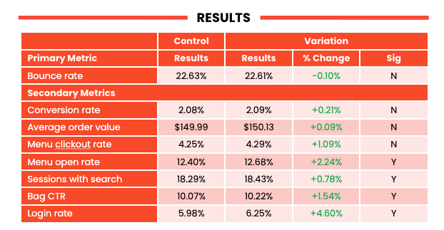
impact and results
Across twelve months and eight feature areas, the Myer PDP redesign touched every stage of the product discovery and purchase journey. Below is a consolidated summary of quantitative outcomes alongside the usability research scores that informed each design decision.
what i learned?
The most dangerous phrase in design is 'it tested well in isolation.'
Products live together. Pricing, imagery, size confidence, and stock availability are not separate features — they are a single argument the page is making to the customer.
On designing for complexity
The pricing and promotions work taught me that designing for the average case is not designing at all. You have to stress-test your system against every realistic edge case — all 40 of them — before you can claim the design actually works. Most design systems break at the edges. The edges are where real customers live.
On research as a design tool
Watching six separate users try to zoom into a product image during a single test session — using their browser's built-in zoom, awkwardly, unsuccessfully — is worth more than any analytics report. The analytics would tell you that users don't zoom. The research tells you that they desperately want to and have given up trying. Those are completely different problems requiring completely different solutions.
On the limits of progressive disclosure
Hiding 13 of 17 colour options behind a 'show more' button is not simplicity — it is false simplicity. When variety is the product's selling point, concealing it is an act of self-sabotage. The intent was sound; the execution was wrong. Redesigning it based on user feedback rather than defending the original decision was the right call.
On scope and negotiation
The illustrated size guide with body measurement diagrams was technically sound and user-validated, but the taxonomy proved too complex for the development team's current sprint capacity. Knowing when to document something for a future cycle rather than fight for it in the current one is a design skill that doesn't show up in portfolios but matters enormously in practice.
Process
For each feature area, I ran a consistent loop: understand the current state through data and observation, design a solution grounded in behavioural insight, test it with real users before a single line of code was written, and track the outcome post-launch.
researchch
Unmoderated usability testing with 50 participants per feature — matched to Myer's core demographic — across desktop and mobile independently. 12 moderated video interviews for the core PDP redesign, plus competitive benchmarking studies against House and Temple & Webster using SEQ scoring.
duration
12 Months — Desktop & Mobile
DESIGN
Figma across every layer of the experience: adaptive image layouts, a pricing system handling 40 promotional combinations, full-bleed mobile experiences, a rebuilt mini bag with compound savings and loyalty acquisition, dynamic size tables with TrueFit peer data, and category-specific architectures for fragrance, skincare, and apparel.
OVERVIEW
A full redesign of Myer's Product Detail Pages across desktop and mobile — covering imagery, pricing, size & fit, stock visibility, the mini bag, and category-specific experiences for apparel, fragrance, skincare, and more.
Let’s Work Together
If you're interested in working with us, complete the form with a few details about your project. We'll review your message and get back to you within 48 hours.